My role
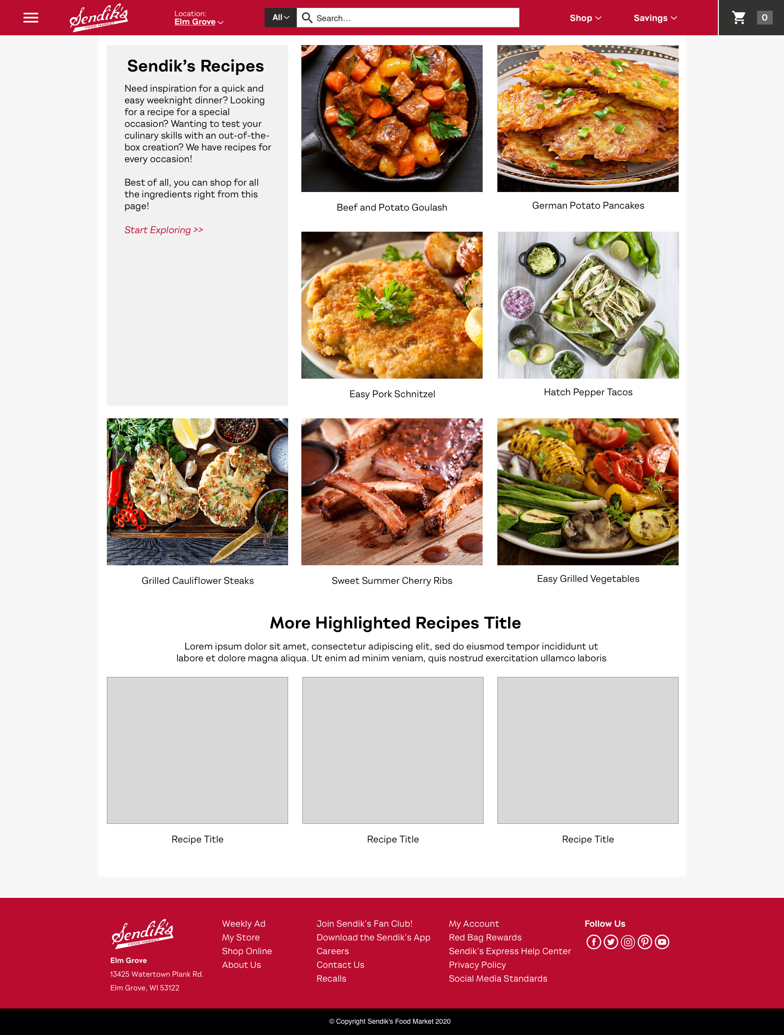
Defined the mobile experience and designed every page.
Context
Mobile-first online grocery, scaled to desktop browsers.
Status
Development began in fall 2020; redesign documented here.
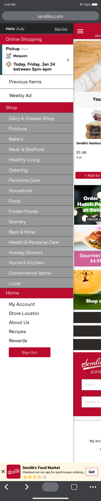
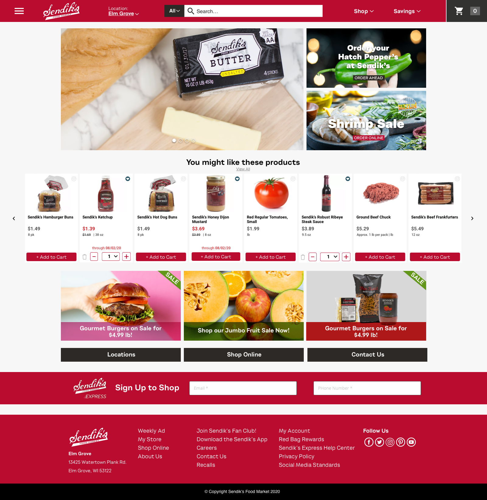
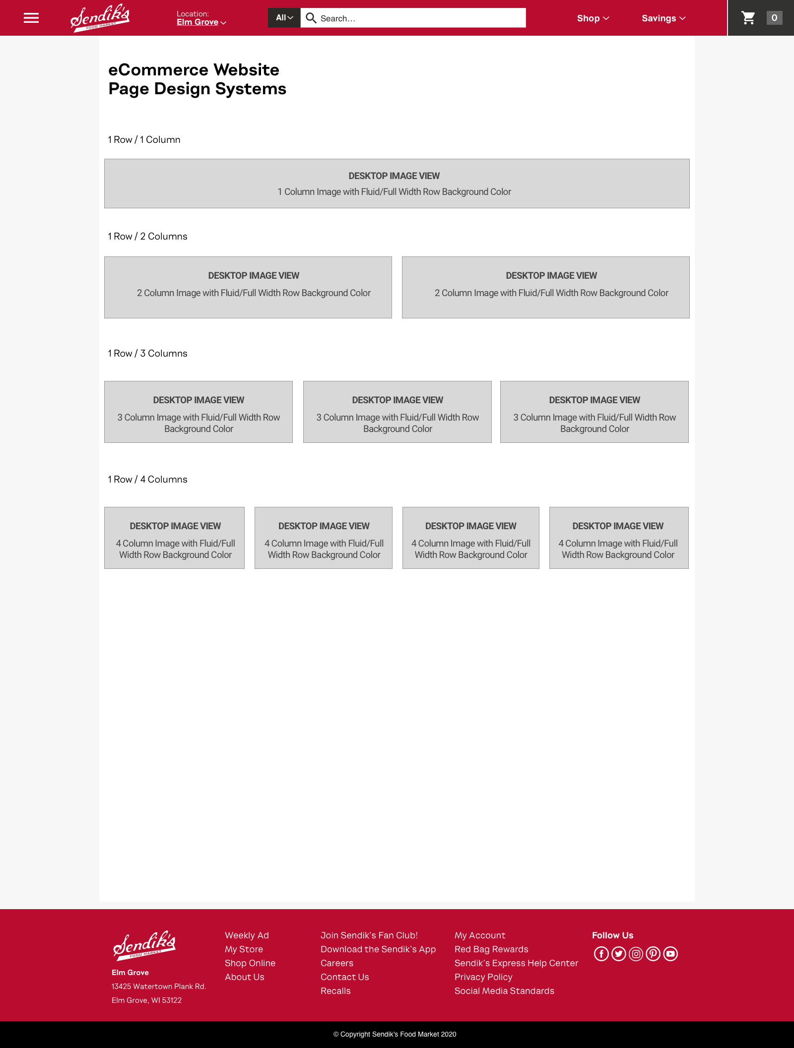
Freshop’s storefront themes had been built desktop-first since 2014, with layouts adapted for mobile. I proposed flipping that: design the mobile experience first, then scale it up to the desktop browser with the same experience.
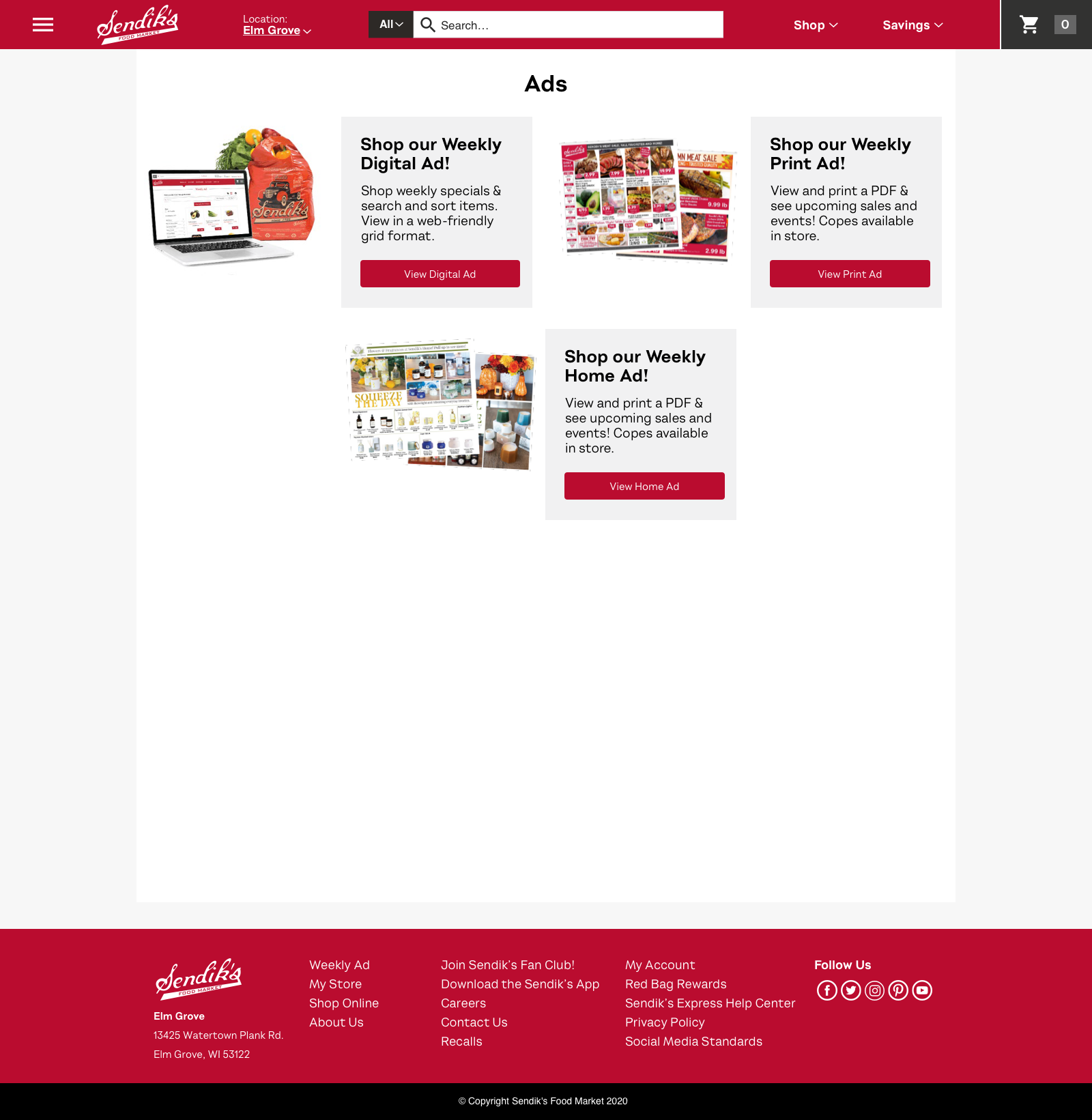
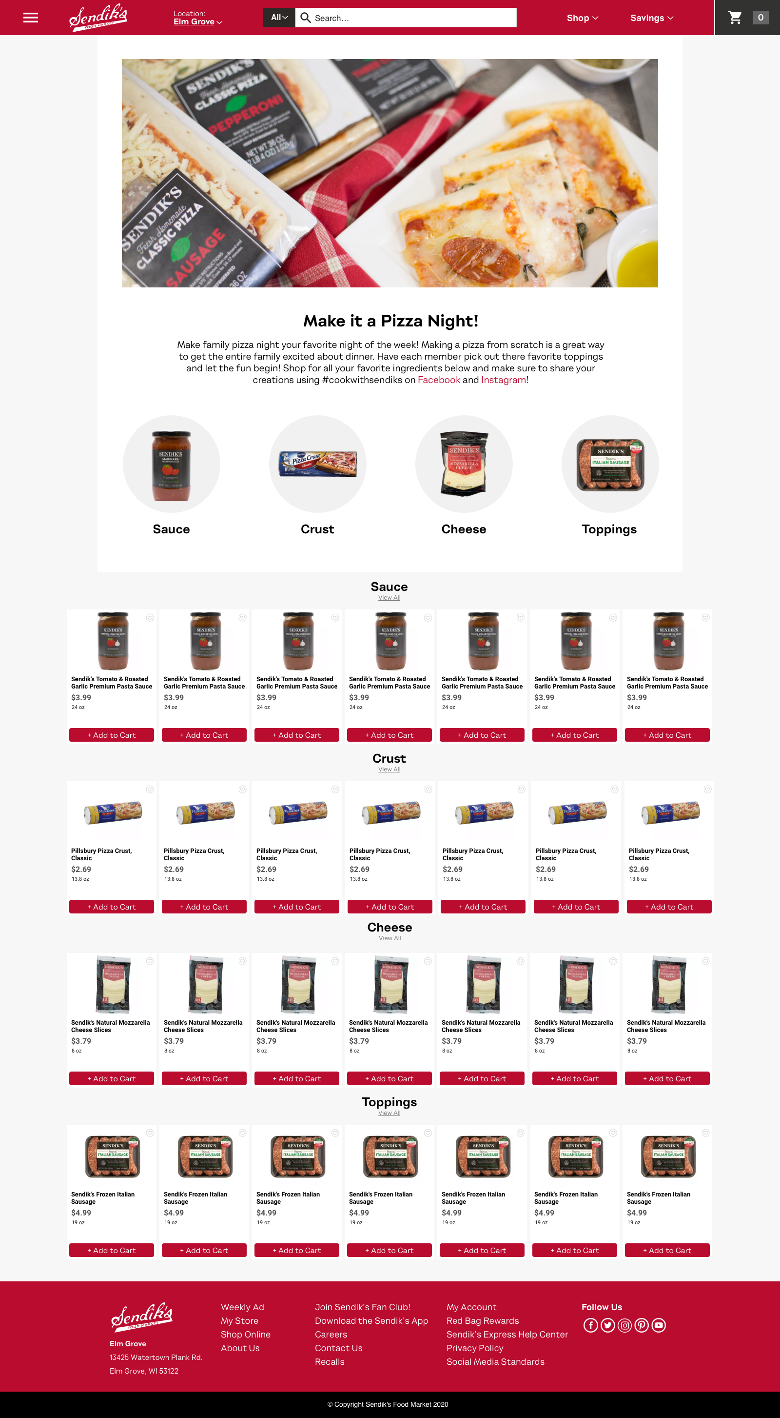
Sendik’s was where that proposal became a full redesign. I defined the mobile experience for online grocery and designed every page. Development started in fall 2020.
At the time, Sendik’s marketing team managed the site.