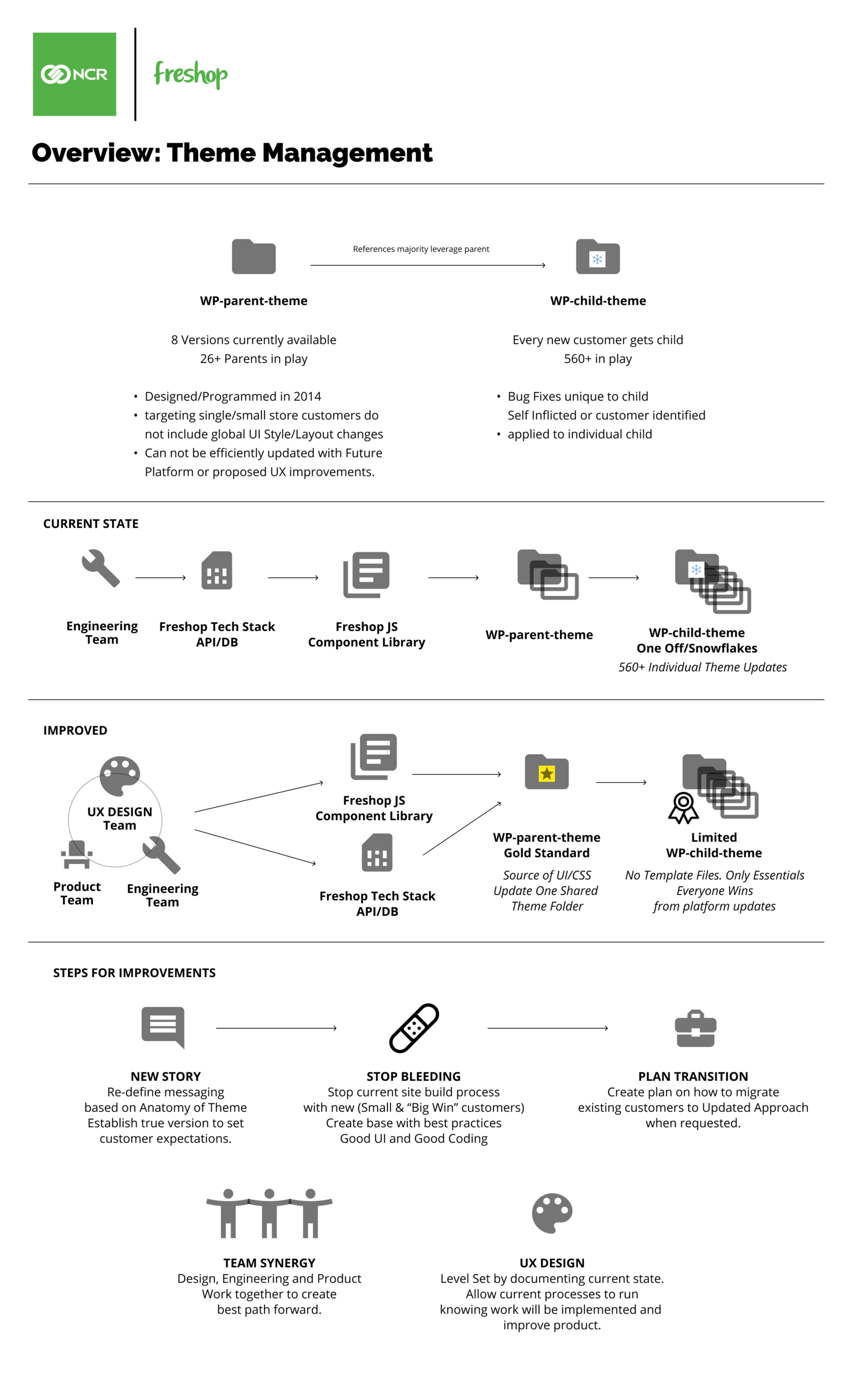
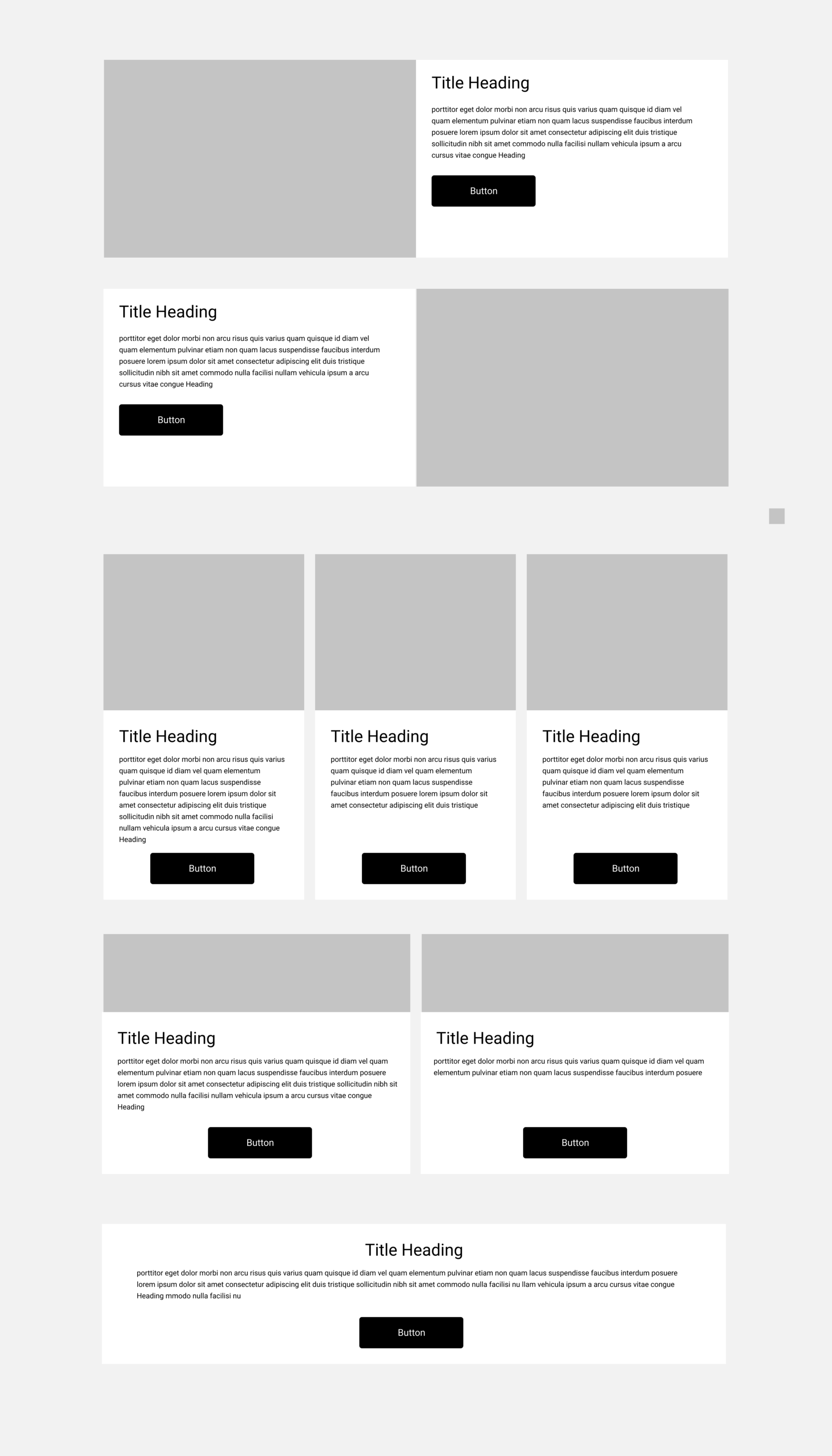
Through my work with customers, I identified the need for having pre-programmed layout blocks (Design Systems) available for them to add content to their sites. By creating a design system using rows and columns, I created a series of pre-set blocks that could be added to the SiteOrigin Layout plugin to be easily added to their pages. The layouts are added to a custom plugin for the reason to update/add new layouts as they are created. It is then “pushed” to all the customer websites from one location at once. It has been very well received by customers and our front-end web team of engineers. It is quick, easy, and consistent. We use this site as our development/production site for this work: SiteOrigin Layout Blocks website
Read MoreUX/UI Sendik’s Food Market Redesign
Freshop began in early 2014 and built there store website themes in WordPress as “Desktop First” and mobile responsive. I’ve proposed changing this to be “Mobile First” and then respond to be presented on Desktop computer browsers with the same user experience. These designs started development production in Fall 2020. These are the screen’s exported from Sketch App to show the various layouts. My role was to lead the definition of the best mobile experience for online grocery and execute the design of all of the pages for the complete redesign. The website is managed by the Sendik’s Marketing team: Sendik’s Food Market website
Read MoreUX/UI – Foodtown Website Redesign
Foodtown is a multi-store banner in the New York City Metro area. It was the first customer for Freshop. We are now working on the completed redesign of their mobile and desktop website. My role has been to lead the definition of the “improved” user experience. In addition to the conceptual work, I have created the user interface design using SketchApp and hand programmed elements of the design using HTML/CSS. The website is managed by Allegiance Retail Services Marketing team: Foodtown website
Read MoreTrade Show Design
I’ve been responsible for the design and execution of creating an improved Trade Show Booth design. This task includes creating print collateral, advertising design, banner design, motion graphics, apparel, booth layout, and motion graphics. It is a task that I complete while managing my daily activities of client work.
Read MoreFlow Charts
Often, I am asked to take abstract concepts of how the platform works or what the shopping flow is for the platform. These are used in slide deck presentations or in proposals to prospective customers. These are some examples of different treatments while applying existing brand guidelines for continuity.
Read MoreFreshop | Web Browser Theme Process
Freshop UX/UI/Product Designer
Ciao Venezia – Augmented Reality Typography Experiment
I’ve always been attracted to the space between analog and digital. I was researching how to animate a printed poster and found that augmented reality was my solution. I found that AR can be used for much more than that. One concept that grabbed my attention that I explored was creating three-dimensional objects. For me, it would be the words “Ciao Venezia” as a typographic object. Here is a bit of the “why” of the project. If you can create a 3D object and place it into your environment without defiling your environment, wouldn’t you want to try it? If I had to pick one thing that inspired me, I would pick the Iamsterdam sculpture that I saw a couple of years ago. Large, physical, and typographic! I knew I was heading to Venice, Italy for a conference with my wife. I went into overdrive in figuring out how to make an AR project that would allow me to place a large typographic (and virtual) sculpture to integrate it into the impressive Venetian landscape. Then capture the images using the functionality of the app to experiment with the concept. I can see this being useful for the travel industry. Putting a logo or graphic into an environment and then allowing photographs to be generated is a great way of creating easy content for a social medial post. Making it fun to create and participate in the placement of the graphic will certainly get people to engage with the project. Then, extend it into social sharing for extended reach. Truly, had no idea if it would work. Never working with anything like this, I thought it would be cool to see. Giving me enough encouragement to built it. I gave it a go. Wow. It worked pretty darn good. I have a broad knowledge of various graphics software and have enough programming experience that I can hack my way through my ideas. This builds new knowledge and gives me one more tool in my creative arsenal. This project includes the creation of a basic typographic vector in Adobe Illustrator. Then creating outlines and importing the .SVG into Autodesk’s Fusion 360. It was here I was getting out of comfort zone. I needed to add translucent skins to the 3D sketch and export. I struggled but came out with a way of creating an .OBJ and using another software to ensure the…
Read MoreHope | Nope – Interactive Typographic Art
Every now and again, I get the opportunity to include all of my skill sets and teach myself something new. This piece uses many of my “maker-based” skills of 3D printing, CNC-routering and laser cutting to create the objects. Then I was able to teach myself how to wire basic LED’s to an arduino and sonic sensor. Conceptually, the intent was to use the interactive capability of the sonic sensor to control the LED lights. Each word is wired separately with HOPE being blue and NOPE being red. Blue and Red being the colors of US political parties. Hope being Obama’s call to action. Nope being a response to Trump. The viewer activates the word Hope between 12 feet and 4 feet. It is a translation of 8 years of Obama. The closest 4 feet are for 4-years of “Nope”. Special mention to Mike at THE CONSTRUCT at RIT for all the assistance and access to tools to make this happen.
Read MoreHold Fast – Message in a Bottle
Robin (Cass) and I were invited to participate in a group exhibition that incorporates the use of light. This collaboration is an extension to our summer 2017 exhibition called “If anything happens…”. Taking on the theme of 19th century maritime communication. Also known as, message in a bottle. Robin is a glass artist and I am a typographic artist. Together, we have a strong narrative that we enjoy exploring that has formal, yet, contemporary context. The piece has LED lights built into the shelf/stand that are controlled by a sonic sensor and arduino. As you approach, the light gets brighter. Light is used as a material to create an interactive engagement of “hope”. Once close to the work, you move yourself around and the text on the wall gets “inserted” into the bottle. Hold Fast is a bit of a contradictory term if you are in a hurry to be rescued at sea. We are in the state of waiting for help and hope. The best we can do is make art about it.
Read More